Our new Dashboard feature is available upon request for the initial launch phase. Please contact your Customer Success Manager if you'd like to schedule implementation with our Services team.
Overview
The following is a brief description of the different types of Chart available on the Dashboard Builder.
Chart Types
- Bar Chart: Bar Charts compare categorical aggregate values. For example, a Bar Chart compares the amount/percentage of a population that attends various categorical events. Users can create Horizontal or Vertical Bar Charts.
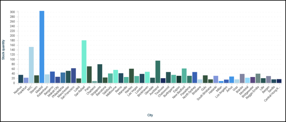
Bar Chart
- Line Chart: Line Charts show changes in an aggregated value over a continuous dimension (Category), usually time. For example, a Line Chart shows the number of orders placed over time.
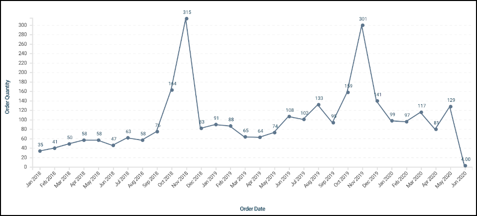
Line Chart
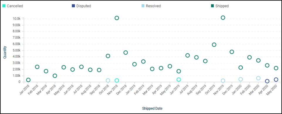
- Symbol Chart: Symbol Charts show aggregated values emphasizing the highest and lowest data points.
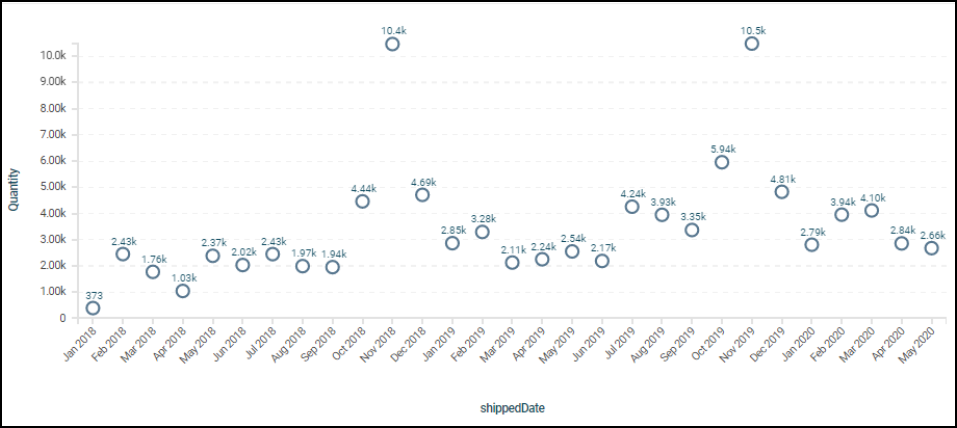
Symbol Chart
- Multi-series Bar Chart: Multi-series Bar Charts present a single value in more than one Category. Users must add a single Category, Value and Series field to create something similar to a Pivot Chart. A Multi-series Chart consists of two dimensions and a measure.
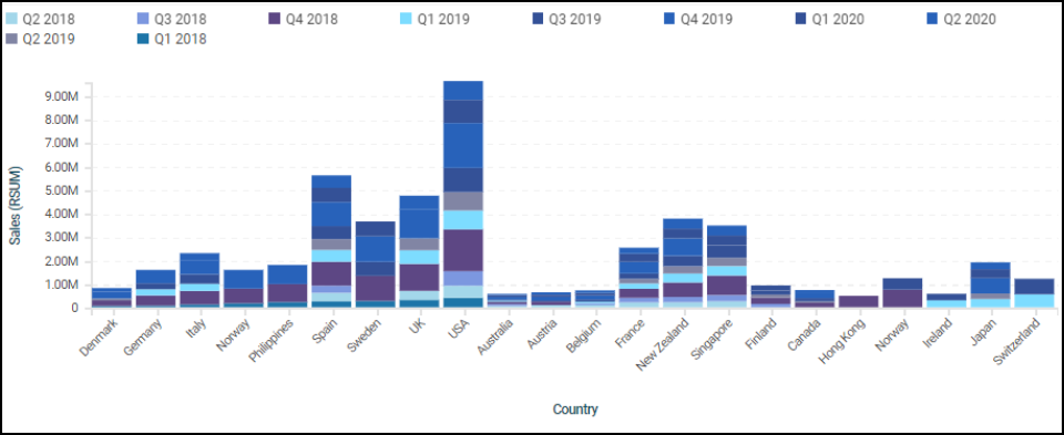
Multi-series Bar Chart
- Multi-series Line Chart: Multi-series Line Charts present a single value in more than one series (Categories). Users must add a single Category, Value and Series field to create something similar to a Pivot Chart. A Multi-series Chart consists of two dimensions and a measure.
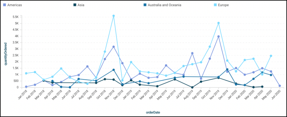
Multi-series Line Chart
- Multi-series Symbol Chart: Multi-series Symbol Charts present a single value in more than one category. Users must add a single Category, Value and Series field to create something similar to a Pivot Chart. A Multi-series Chart consists of two dimensions and a measure.
Multi-series Symbol Chart
- Combo Chart: Combo Charts allow users to layer multiple XY Charts (Bar Charts, Line Charts, and Symbol Charts) in a single Chart. Combo Charts consist of one shared dimension or Category and multiple measures or Values and are used to compare different metrics grouped by the same category.
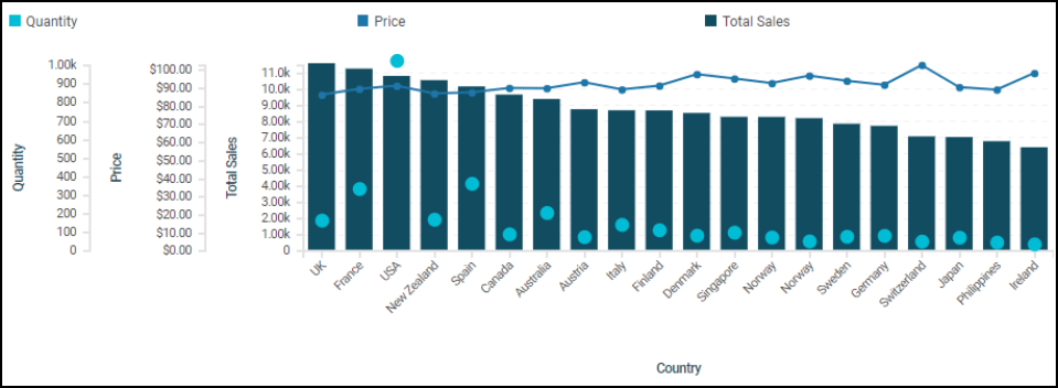
Combo Chart
- Funnel Chart: Funnel Charts display data values as progressively decreasing/increasing proportions that add to the total. Each stage of the Funnel Chart is determined by the corresponding value (as a percentage of all values) and is represented in segments. The category order depends on the how the chart is sorted.

Funnel Chart
- Pie Chart: A Pie Chart is a circle divided into slices. The pie represents 100% of the data points selected. Each slice represents a different category.

Pie Chart
- Min/Max Chart: A Min/Max Chart shows a category's Minimum, Maximum, and Average values, showing the range of a measure, like minimum and maximum temperature recorded for each day of the month.
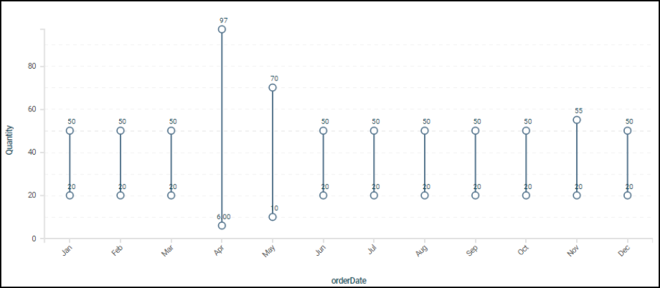
Min/Max Chart
- Indicator Gauge: The indicator Gauge displays a single aggregated metric with the option to compare against the same metric from a different time.
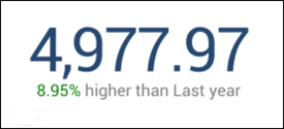
Indicator Gauge
- Dial Gauge: A Dial Chart uses a needle to show a value's position within a range.
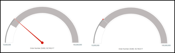
Dial Gauge
- Bullet Gauge: A Bullet Chart illustrates progress toward a threshold. The qualitative ranges are displayed as different colors that can be customized.
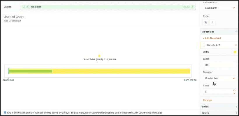
Bullet Gauge
- Table: Tables display data in rows of consecutive columns in a spreadsheet-like format. This form of visualization provides an easy way to view data and perform various analytical functions.

Table
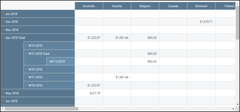
- Expanded Table: Expandable Tables group banded reports. Each row presents a distinct value from the grouping field with special formatting highlighting the value. The number of detail records associated with the grouped value is displayed in parentheses adjacent to the grouped values. Expandable tables are especially useful for organizing datasets with many rows, as multiple detail rows are collapsed by default.

Extended Table
- Crosstab: A Crosstab table shows data aggregated across two dimensions in a matrix style to show the correlation between different variables and the values in the cross-section of the dimensions. Crosstab Charts are used when we want to show the relationship between two Categorical values.
Crosstab Table
- Heatmap: Heatmaps are forms of visualization that represent data in colors, mapping ranges of values to ranges of colors. With careful selection of the color spectrum used in a heatmap, higher data values may appear hot and lower values appear cold.

Heatmap
- Dot Map: Dot Maps display the actual geolocation of each record in the dataset as a dot on a map.

Dot Map
- Bubble Map: Bubble Maps show aggregated values in precise locations, with each bubble area proportional to the value represented (the higher the value, the bigger the bubble).

Bubble Map
- Choropleth Map: Choropleth maps are a heatmap suitable for visualizing geographical divides of areas or regions, shaded according to the aggregated values. The darker, more intense colors are associated with larger data values.

Choropleth Map
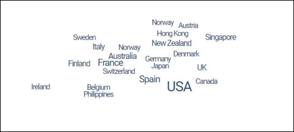
- Word Cloud: A Word Cloud is a visual representation of text data in which the importance or frequency of individual words is represented using the font size. The more important or frequent a word is, the larger it appears.
Word Cloud