Overview
The Style panel allows users to control various visual aspects of the charts: change the color, turn on/off-axis labels, and more.
This section is available for all chart types except for Word Cloud. However, the options in it vary among different chart types.
User Account Requirements
The user account you use to log into Resolver must have Administrator permission or Data Management advanced permissions to add Styles to a Chart.
Related Information/Setup
To create a new Dashboard Data Set, please follow the link below:
After creating a Dashboard Data Set, the user must publish it before it can be used with the Dashboard Data Set Builder. Please follow the link below for more information on Publishing a Dashboard Data Set.
For Information on Adding a Chart Type not covered by these instructions please see the corresponding articles below.
- Adding a Chart to a Dashboard
- Adding a Multi-Series Chart to a Dashboard
- Adding a Combo Chart to a Dashboard
- Adding a Table to a Dashboard
- Adding a Crosstab to a Dashboard
- Adding a Heatmap to a Dashboard
- Adding a Map to a Dashboard
- Adding a Box and Whiskers Chart to a Dashboard
Navigation
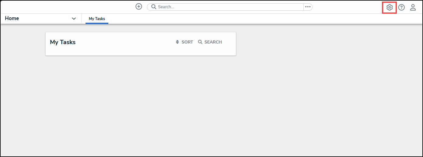
- From the Home screen, click the Administration icon.
Administration Icon
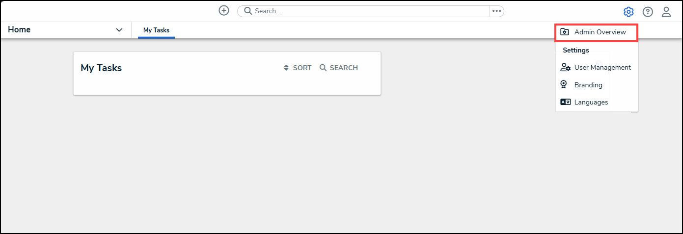
- From the Administrator Settings menu, click the Admin Overview link.
Administrator Settings Menu
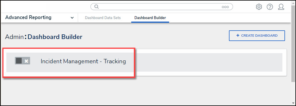
- From the Admin Overview screen, click on the Dashboard Builder tile under the Views section.

Dashboard Builder Tile
- From the Dashboard Builder screen, click on a Dashboard Name.
Dashboard Name
- From the Dashboard screen, to access the Chart screen, click on the Add Chart button.

Add Chart Button
- Or click on the More Options icon on an existing Chart View.

More Options Icon
- Select the Edit option from the More Options dropdown menu.

Edit Option
- From the Chart screen, click on the Styles panel on the Configuration panel.

Styles Panel
- From the Styles panel, select the following options:
General Chart Options
The General Chart Options apply to the majority of Chart Types. For Chart specific options, please refer to the corresponding section.
- Color Type:
- Single Color: The Single Color option uses one color to represent all bars/data points on the Chart.
- Color: If Single Color is selected as the Color Type, the Color field allows the user to select the color used to represent the bars/data points on the Chart from the Color Palette pop-up.
- By Category: The By Category option uses a different color to represent each category on the Chart.
- Theme: If By Category is selected as the Color Type, the user can apply one of the predefined color themes or a custom theme to the Chart. As a result, the colors on the Chart are picked from the range defined in the selected theme.
- Match Colors Across Charts: The Match Colors Across Charts option uses the same color for each categorical value across all charts that use the same dataset throughout the application, depicting a Category in the same color.
- Multi-series Type (Multi-series Combo): The Multi-series Type allows a user to select the type of Chart you want to display (Bar, Line, or Symbol).
- Chart Orientation: The Chart Orientation option allows users to select the bar/spike orientation on the Chart (vertical or horizontal).
- X-Axis and Y-Axis:
- Axis Title: The Axis Title option will enable or disable the x-axis title (label).
- Custom Label: The Custom Label option allows users to create your axis label.
- Typeface: The Typeface dropdown allows users to customize the Custom Label by choosing a font type.
- Weight: The Weight dropdown allows users to customize the Custom Label by choosing a font-weight option which affects the thickness of the font depending on the Typeface (font type) selected.
- Size: The Size dropdown allows a user to customize the Custom Label by choosing a font size.
- Font Color: The Font Color option allows a user to customize the Custom Label by choosing a font color.
- Values: The Values option will enable or disable the x-axis category values.
- Values Rotation: The Values Rotation option allows a user to select how the x-axis values will appear (horizontal, diagonal, or vertical).
- Format: The Format option will appear for numeric values and allows the user to select a value format:
 |
Default: The Default Values Format will show the whole value. |
 |
Abbreviated: The Abbreviated Values Format will abbreviate the value's unit of measure (e.g., k - kilo, M - million, etc.). |
 |
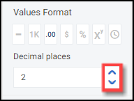
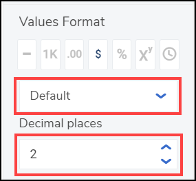
Decimals: The Decimals Values Format will include decimal places in the value. Set the number of decimal places in the Decimal Place field by clicking the increase or decrease arrows.
 Decimal Place Field |
 |
Currency: The Currency Values Format will display the value as a currency (e.g., $1,234,567.89). You can select a currency type from the Currency dropdown menu. Set t0he number of decimal places in the Decimal Place field by clicking the increase or decrease arrows.
 Currency and Decimal Fields
|
 |
Percentage: The Percentage Values Format will display the value as a percentage (e.g. 50%). |
 |
Scientific: The Scientific Value Format will display the value as an exponential notation (e.g., 1e+6). |
 |
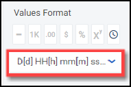
Duration: The Duration Value Format will display the value in date and time format (e.g., 1D, 12H, 59M, 25S). Users can select a Date and Time format from the Format dropdown menu.
 Format Field
|
- Scale Type: The Scale Type allows the user to choose a Chart Scale Type:
- Linear: A Linear Scale Type displays data values on the y-axis at equal distances apart (e.g., 1- 100 is the same size as 100 - 200). A Linear Scale Type does not work with data values spread over a large range.

Scale Type Linear
- Logarithmic: A Logarithmic Scale Type displays data values on the y-axis that are not equal distances apart (e.g. 1 - 10 is the same size as 10 - 100).

Logarithmic Scale Type
- Min Range/Max Range: The Min and Max Range setting allows a user to change the Chart values range by using the increase and decrease arrows or by clicking the field and entering a new Min or Max Range value. Entering Auto into the Min or Max Range field will allow the system to decide the best minimum or maximum range for the Chart.
- Steps: The Steps option allows a user to set the number of intervals or steps (e.g., 0, 10, 20, 30, etc.) on the y-axis by using the increase and decrease arrows or by clicking the field and entering a new Steps value. Entering Auto into the Steps field will allow the system to calculate the number of Steps based on the axis scale range and the dataset values.
- Data Labels: The Data Labels checkbox allows a user to enable or disable Data Labels at the top of each bar/data point on the Chart. If Data Labels are disabled, the Borders checkbox will not appear as a configurable option.
- Borders: The Borders checkbox allows a user to enable or disable Borders around the Data Labels that appear at the top of each bar/data point on the Chart.
- Shading: The Shading checkbox allows a user to apply a grey background shading to the bars/data points on the Chart.
Bar Chart
- Bar Width %: The Bar Width % option allows a user to set the bar width for bars on the Chart by using the increase and decrease arrows or by clicking the field and entering a new Bar Width %. Entering Auto into the Bar Width % field will allow the system to decide the best bar width for the Chart.
Multi-series Bar Chart
- Bar Width %: The Bar Width % option allows a user to set the bar width for bars on the Chart by using the increase and decrease arrows or by clicking the field and entering a new Bar Width %. Entering Auto into the Bar Width % field will allow the system to decide the best bar width for the Chart.
- Type: The Type option allows the user to select the column type:
- Stacked: The Stacked options stack all series values in the same column.
- Cluster: The Cluster option represents series values using individual bars places side-by-side.
- 100%: The 100% option represents each series as a percentage. The columns go from the bottom to the top of the Chart.
Combo Chart
- Bar Width %: The Bar Width % option allows a user to set the bar width for bars on the Chart by using the increase and decrease arrows or by clicking the field and entering a new Bar Width %. Entering Auto into the Bar Width % field will allow the system to decide the best bar width for the Chart.
- Type: The Type option allows the user to select the column type:
- Stacked: The Stacked options stack all series values in the same column.
- Side-by-Side: The Side-by-Side option represents series values using individual bars places side-by-side.
Multi-series Combo Chart
- Multi-series Type: The Multi-series Type allows a user to select the type of Chart you want to display (Bar, Line, or Symbol).
- Bar Width %: The Bar Width % option allows a user to set the bar width for bars on the Chart by using the increase and decrease arrows or by clicking the field and entering a new Bar Width %. Entering Auto into the Bar Width % field will allow the system to decide the best bar width for the Chart.
- Type: The Type option allows the user to select the column type:
- Stacked: The Stacked options stack all series values in the same column.
- Side-by-Side: The Side-by-Side option represents series values using individual bars places side-by-side.
Line Chart or Multi-Series Line Chart
- Line Thickness: The Line Thickness option allows a user to select how thick the line on the chart appears (thin, normal. or bold).
- Line Style: The Line Style option allows a user to select the style of the line on the chart (solid, dash, or dot).
- Line Type: The Line Type option allows a user to select the type of line used on the chart (straight, monotone, cardinal, step before, or step after).
Symbol Chart or Multi-Series Symbol Chart
- Symbol: The Symbol option allows a user to select the Symbol style (circle, square, diamond, triangle down, triangle up, x, or cross).
- Fill: The Fill option allows a user to select the Symbol's fill style (fill or outline).
Min/Max Chart
- Line Thickness: The Line Thickness option allows a user to select how thick the line on the chart appears (thin, normal. or bold).
- Line Style: The Line Style option allows a user to select the style of the line on the chart (solid, dash, or dot).
- Symbol: The Symbol option allows a user to select the Symbol style (circle, square, diamond, triangle down, triangle up, x, or cross).
- Fill: The Fill option allows a user to select the Symbol's fill style (fill or outline).
- Line Opacity: The Line Opacity option allows a user to set the line opacity (solid to opaque); more opaque makes the background map more visible.
Funnel Chart
- Mode: The Mode option allows a user to select the way the Funnel Chart is displayed:
- Height: The Height mode places the highest value at the top of the Chart and gradually decreases with each stage smaller than the previous one. The Funnel Chart looks like an inverted pyramid.
- Width: The Width mode places the highest value at the top of the Chart and decreases with each aggregate segment of equal value having a uniform width.
- Category Labels:
- Category Name: The Category Name option allows the user to enable or disable the Category Name that appears on the y-axis.
- Custom Name: The Custom Name field allows the user to enter a custom Category Name.
- Segment Names: The Segment Names option allows the user to enable or disable Segment Names on the Chart.
- Names Rotation: The Name Rotation option allows the user to adjust the angle of the Segment Names on the Chart (horizontal, diagonal, or vertical).
- Values: The Values option displays the data field value for the segment.
- Percentage: The Percentage option shows the percentage of the maximum value calculated by dividing the current value by the maximum value.
Pie Chart
- Type: The Type option allows the user to change the style of the pie chart (pie or donut).
- Data Labels: The Data Labels option allows the user to enable or disable segment labels on the Chart.
- Values: The Values option allows the user to enable or disable segment values on the Chart.
- Percentages: The Percentages option allows the user to enable or disable segment percentages.
Tables, Expandable Tables, and Crosstab
- Header:
- Typeface: The Typeface dropdown allows a user to customize the Table header values by choosing a font type.
- Weight: The Weight dropdown allows a user to customize the Table header values by choosing a font-weight option which affects the thickness of the font depending on the Typeface (font type) selected.
- Size: The Size dropdown allows a user to customize the Table header values by choosing font size.
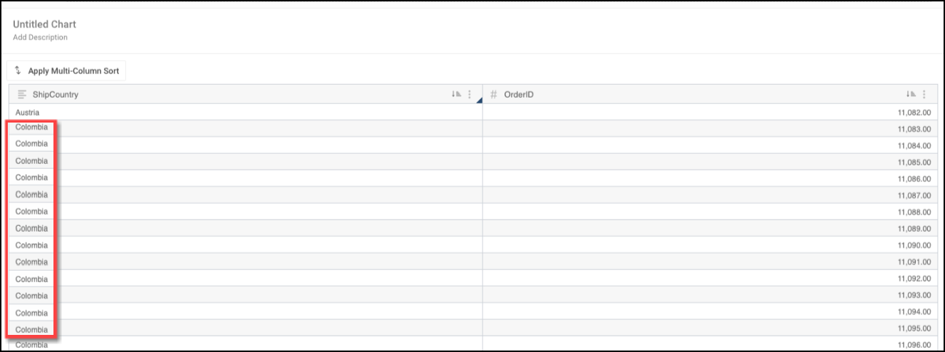
- Align: The Align dropdown allows a user to apply text alignment (default, left, center, or right) to all columns or a specific data value. The Default alignment is left align.
- Font Color: The Font Color option allows a user to customize the Table header values by choosing a font color from the color palette.
- BG Color: The BG Color option allows a user to customize the header background color by choosing a background color from the color palette.
- Border: The Border option allows a user to apply a border around the outside of the Table.
- Body:
- Typeface: The Typeface dropdown allows a user to customize the Table values by choosing a font type.
- Weight: The Weight dropdown allows a user to customize the Table values by choosing a font-weight option which affects the thickness of the font depending on the Typeface (font type) selected.
- Size: The Size dropdown allows a user to customize the Table values by choosing font size.
- Align: The Align dropdown allows a user to apply text alignment (default, left, center, or right) to all columns or a specific data value. The Default alignment is left align.
- Font Color: The Font Color option allows a user to customize the Table values by choosing a font color from the color palette.
- BG Color: The BG Color option allows a user to customize the header background color by choosing a background color from the color palette.
- Alternate Color: The Alternate Color option allows a user to apply a secondary color to the Table values in every other row by choosing a color from the color palette.
- Alternate BG Color: The Alternate BG Color option allows a user to apply a secondary color to the row background in every other row by choosing a color from the color palette.
- Text Wrapping: The Text Wrapping option allows a user to apply text wrapping to the Table values wrapping the text to the line below if the text takes up more space than the width of the cell allows.
- Repeatable Rows: The Repeatable Rows option allows a user to display repeatable row values for a column when using the Table Grouping option.
Repeatable Rows Option
- Border: The Border option allows a user to apply a border around the Table (outer, horizontal, or vertical).
- Border Color: The Border Color option allows a user to apply a color to the Table border by choosing the color from the color palette.
- Resize Rows:
- Row Height: The Row Height option allows a user to adjust the height of the Table rows by using the increase and decrease arrows or by clicking the field and entering a new row height value. Entering Auto into the Row Height field will allow the system to decide the best row height.
Heatmap
- Y-Axis:
- Custom Scale: The Custom Scale option allows a user to adjust the number of Color Steps in a Data Value Range and adjust the Ranges min and max shown on the Heatmap. By default, a Heatmap is divided into five steps from lowest to highest.
- Color Steps: The Color Steps option allows a user to adjust the number of color steps to use within a Data Value Range.
- Min Range: The Min Range option allows the user to adjust the Data Value Range minimum value displayed on the Heatmap.
- Max Range: The Max Range option allows the user to adjust the Data Value Range maximum value displayed on the Heatmap.
- Reversed Colors: The Reversed Colors option reverse the order in which the colors are displayed on the Heatmap.
- Custom Scale: The Custom Scale option allows a user to adjust the number of Color Steps in a Data Value Range and adjust the Ranges min and max shown on the Heatmap. By default, a Heatmap is divided into five steps from lowest to highest.
- Gaps:
- Horizontal Gap: The Horizontal Gap option allows the user to adjust the space between columns on the Heatmap by using the increase and decrease arrows or by clicking the field and entering a new row height value.
- Vertical Gap: The Vertical Gap option allows the user to adjust the space between rows on the Heatmap by using the increase and decrease arrows or by clicking the field and entering a new row height value.
Dot Map, Bubble Map, and Choropleth Map
- Color: The Color option allows a user to change the Dot color used to represent each record in the dataset on the map.
- Base Map: The Base Map option allows a user to set the map view (street, outdoor, light, dark, satellite, or satellite street) used to display the Dot Map.
- Map Region: The Map Region option allows a user to set the default map location (initial view) for the Dot Map by choosing a location from the dropdown menu.
- Map Borders: The Map Borders option allows a user to enable or disable country and region borders on the Dot Map.
- Allow Clustering: The Allow Clustering option allows a user to enable or disable data point clustering. When enabled, data points in the same geolocation will be clustered and represented by a single icon.
- Data Labels: The Data Labels option allows a user to enable or display data point labelling when the Allow Clustering option is enabled.
- Custom Scale (Choropleth Map): The Custom Scale option allows a user to adjust the number of Color Steps in a Data Value Range and adjust the Ranges min and max shown on the Map. By default, a Map is divided into five steps from lowest to highest.
- Color Steps (Choropleth Map): The Color Steps option allows a user to adjust the number of color steps to use within a Data Value Range.
- Min Range (Choropleth Map): The Min Range option allows the user to adjust the Data Value Range minimum value displayed on the Map.
- Max Range (Choropleth Map): The Max Range option allows the user to adjust the Data Value Range maximum value displayed on the Map.
- Reversed Colors (Choropleth Map): The Reversed Colors option reverse the order in which the colors are displayed on the Map.
Box and Whiskers
- Lines/Whiskers Thickness: The Lines/Whiskers Thickness option allows a user to adjust the line thickness of the whiskers on the Chart (thin, normal, or bold).
- Display Outliners: The Display Outliners option allows a user to enable or disable displaying outliner data points which appear outside of the whiskers on the Chart.
- Symbol: The Symbol option allows a user to change the symbol that represents the outliner data points on the Chart (circle, square, diamond, triangle down, triangle up, x, or cross).
- Fill: The Fill option allows a user to select if the outliner data points appear filled in or hollow.
- Opacity: The Opacity option allows a user to set the box and whisker opacity (solid to opaque) more opaque.
- Click the Save Chart button to save any Style changes applied to the Chart.